如果免费资源下载的文件为TXT文档 请联系站长更新!站长微信:Lv596999 Telegram:@eapoj “Mql5官网”板块的EA基本都有,大部分是无限制NODLL版,NODLL版本MT1420升级,大多数不可用!这些EA来源为国外花钱买过来的 如有需要,请联系站长! “EA测评”板块资源全部现有,看见不错的,可以联系站长,看EA在确定是否收费。 “无限制EA”板块,大部分免费,下载文件全部存在,都可以免费下载。 站长硬盘EA太多,因大部分时间做交易,做风控,没太多时间更新下载地址,请谅解! 需要更新下载文件,请联系站长微信!国外朋友请联系Telegram。  |
The dashboard should help to get a quick overview of the correlations of different assets to each other. For this, the value series are compared according to the Pearson method. The result is the value of the correlation (in percent). With the new single asset mode, you can immediately see which symbols have the highest positive or negative correlation. This prevents you from accidentally taking a risk on your trades with highly correlated symbols.
Usage
There are different methods for the correlation. In the so-called carry trade, an underlying is bought. A highly negatively correlated pair is sold. The respective swaps play an essential role in this method. Another method is to hedge positions. A position should be hedged by buying or selling a correlated pair.
Display of the indicator
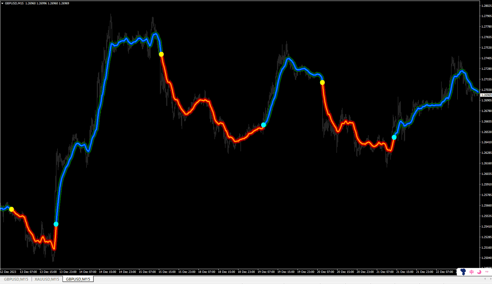
The calculated values of the correlation are displayed in the matrix. Values from -100% (absolutely negative correlation) to 100% (absolutely positive correlation) can be displayed. If a (!) Is displayed after the value, the number of bars is smaller than the set number of periods. If there are less than three bars for the underlying, no correlation is calculated. Then an “X” is displayed.
Options
(01) Mode
Switch between the new single asset mode and the classic dashboard view
(02) Use hole market watch symbols for single asset mode
If this is set to true, all symbols in your market watch are taken into account of the correlation calculation (only valid in single asset mode)
(03) How many correlated pairs to show
Set how many symbols are to be displayed in single asset mode
(08) underlyings
A list of underlyings separated by commas. Please note that all selected assets are also marked as active in MT4. Otherwise, the Dashboard will not return values for this UL.
(09) prefix
Enter the characters to be prefixed to the symbols configured in option 08
(10) suffix
Enter the characters to be suffixed to the symbols configured in option 08
(11) use chart timeframe for calculation
If set to true here, the timeframe of the chart is used for the calculation. This setting is suitable for quick switching between the timeframes.
(12) choose actual correlation time period (option 11 false) If false was set for “use chart timeframe”, a timeframe can be specified here. This does not change if you change the chart timeframe.
(13) counting periods Here you set how many periods of the respective timeframe are used for the calculation.
(14) coloring field greater than x Set here the threshold from which a positively correlated pair is marked with a color.
(15) coloring field at less than x Set here the threshold from which a negatively correlated pair is marked with a color.
(21-28) Fonts and colors (appearance)
Configure the dashboard the way you want it to be and how it fits on the screen.
(29) vertical offset
Move the dashboard vertically to another position
(30) horizontal offset
Move the dashboard horizontally to another position
(31) Subwindow
Do you want to show the dashboard/single asset mode in main chart, first or second subwindow
(32) dashboard layout
Set the dashboard layout, if you have trouble to view on small screens
Note: This indicator can not be used in the Strategy Tester. So the demo version here from the market does not work. Please use the free version of the indicator for testing: https://www.mql5.com/de/market/product/33914
![图片[1]-Netsrac Correlation Dashboard 外汇EA-EA侦探社 - 全球领先的MQL5官网外汇EA机器人MT4自动化交易EA资源免费分享网站](https://sp-ao.shortpixel.ai/client/to_webp,q_glossy,ret_img/https://www.mql5.vip/wp-content/uploads/2024/05/20240514143334-6643763e76b00.png)
![图片[2]-Netsrac Correlation Dashboard 外汇EA-EA侦探社 - 全球领先的MQL5官网外汇EA机器人MT4自动化交易EA资源免费分享网站](https://sp-ao.shortpixel.ai/client/to_webp,q_glossy,ret_img/https://www.mql5.vip/wp-content/uploads/2024/05/20240514143334-6643763eaf70a.png)
![图片[3]-Netsrac Correlation Dashboard 外汇EA-EA侦探社 - 全球领先的MQL5官网外汇EA机器人MT4自动化交易EA资源免费分享网站](https://sp-ao.shortpixel.ai/client/to_webp,q_glossy,ret_img/https://www.mql5.vip/wp-content/uploads/2024/05/20240514143334-6643763eebcfb.png)